17 Sep 2015
When I shared my iOS 9 Notes & Impressions earlier this summer, I barely touched on the platform’s built in support for a new type of extension called “Content Blockers.” That now appears to have been an oversight on my part. Since iOS 9 launched yesterday, Content Blockers have created a firestorm unlike anything I’ve seen in quite some time.
Reactions have been, in hindsight, understandably split. Depending on who you ask, Content Blockers are either the biggest improvement to Mobile Safari since its inception, or a harmful feature implemented by a vindictive Apple, bent on hurting both Google and the established publishing industry in a vein attempt to redirect quality content away from the open web and towards the new Apple News application.
But what are Content Blockers? To get a full understanding of how these new apps work, one needs to understand that the “open” web is spying on you. Perhaps you’ve spent half an hour browsing the web for new shoes, only to find advertisements for footwear following you all around the internet for a week. These aren’t just obnoxious advertisements, they are also bombarding your devices with scripts designed to track exactly what you watch, read, share, and purchase on the web.
There’s no escape: these scripts are bundled with advertising space sold and served by the biggest ad provider on the web, Google. If you click a link and find the page littered with advertisements, there’s a good chance that those advertisements come from Google. There’s an even better chance that those advertisements there are gathering information on your browsing habits to help someone determine how to better inundate you with more, and more effective, adverts.
Not only is this incredibly creepy and a borderline invasion of your privacy, it’s also damaging in a few other ways. Privacy concerns aside, these adverts do hell to your device’s battery. I’m sure every iPhone owner on the planet would like to eek even an hour’s worth of battery out of their phone. What if I told you that, if all of these scripts and ads were to suddenly disappear, Safari would use much less power, and your iPhone’s battery would last significantly longer?
The good news is, that’s exactly what a Content Blocker on iOS 9 is designed to accomplish: a good one will filter the internet of advertisements and sites’ abilities to track your browsing habits, giving you the benefit of a faster, safer, and more secure experience on a device that lasts longer. Content Blockers work on both Mobile Safari (most iPhone users’ browser of choice) as well as any application that supports Safari View Controller, a growing list that already includes one of the largest Twitter clients in use, Twitterrific.
So what’s the issue? Well, if you don’t see a downside, you might not be a publisher. There’s a reason that so many websites rely on advertising, and why so much of that advertising pushes these sorts of tracking technology - your browsing habits are valuable. So valuable, in fact, that modern day mega publishing corporations such as Buzzfeed and Vox rely heavily on these advertisements: they make bank off you. I’m sure most of these big publishing guys are like the rest of us – their hearts don’t beat a flutter when they see a full screen advertisement obstructing content, but they realize that it’s a “necessary” evil and someone’s primary source of income. It enables publishers to deliver quality content to readers that are ravenous for hot takes, personality quizzes, and gossip for the low, low price of zero dollars.
The issue at hand is evident. If all iOS users upgrade to iOS 9 and download a Content Blocker, all of those hundreds of thousands of people will suddenly become of next to no value to advertisers, which will in turn stop generating revenue and then profits for publishers, which could put all your favorite authors at Buzzfeed or wherever else quickly out of a job. This will be especially hurtful for the little guys who don’t have big corporate backers acting as a safety net: the folks at quality niche sites like Six Colors or MacStories.
Apple isn’t being forthcoming as to why they implemented Content Blockers on iOS after nine very successful years without them, and I don’t expect them to ever be. Perhaps that reason is as innocent as wanting to offer a better user experience for Mobile Safari users. Perhaps it’s to push publishers towards Apple News, where adverts are provided by Apple and unblockable. It hardly matters. No matter how you feel about them, Content Blockers are here, and they’re almost certainly staying. From this point forward, more and more people will begin blocking significant portions of the web, and advertisers and publishers will begin to feel the squeeze.
There are a couple of ways this could shake out. The most likely outcome, I think, will be that very little changes. Truthfully, Content Blockers are nothing new – they have existed on desktop platforms, such as Windows, Linux, and the Mac, for years. Given Android’s open nature, I’m sure it’s had the equivalent of Content Blockers since the early days of Android on the HTC G1.
iOS has been the exception to the rule until now, and publishers have survived just fine. Content Blockers have always been, and will very likely always be, a niche product for a few tech savvy folks who know they can shape their web browsing experience to their personal preference while also having enough wherewithal to know how to go out and do it. I believe this is exactly what will happen on iOS 9. It’s not like an Apple sanctioned Content Blocker exists or comes installed on iOS 9 from the get go, nor can I imagine they’ll be pushed by the App Store team all that much: they will exist for the select few who know they want them, and they will be ignored by the majority of users.
But if they were to take off, and if suddenly everyone and their grandfather begins deploying Content Blockers, it’s all too clear what could and maybe should happen: publishers profits will begin to fall. Just as in nature when an environment changes, the strong will adapt and the weak will die. Some will argue that this will be the end of free, high quality content, and maybe they’re right.
But then again, if you have to trade your privacy, your device’s battery life, and a good user experience to access that content, is it really free?
13 Aug 2015
A key theme between both iOS 9 and OS X 10.11 “El Cap”, the two of Apple’s more established platforms, is refinement over reinvention. But then there’s this year’s version of Apple’s other, younger mobile platform – the watchOS, as found on the Apple Watch. Not yet even a year old, the Apple Watch isn’t yet eligible for reinvention. Instead, watchOS 2 focuses on precisely two things - filling in places where the original watchOS fell down, and native applications.
In my pre-WWDC predictions post, I speculated that this year’s update to watchOS could be called watchOS 1.1, and frankly that’s more or less indicative of how watchOS 2 feels. Native third party applications and the introduction of third party complications are, frankly, the two biggest things to write home about, and the both feel like things that perhaps should have (but maybe couldn’t have) been present on launch.
They’re also, unfortunately, the only two things that I have yet to be able to test on my Apple Watch running the watchOS 2.0 Developer Preview, so there’s unfortunately not too much I can say on that front. But if implemented correctly, both have the opportunity to completely change the way I use my Apple Watch, extending its functionality and usefulness in ways not possible today. Whether or not things pan out this way depends almost entirely on developer enthusiasm of the platform – and, given how similar writing watchOS apps are to writing iOS apps, I would say the odds are good we’ll see some pretty impressive stuff pretty fast.
The other features are largely niceties that have yet to really change the way I use (or, in some cases, don’t use) my Watch. You can now compose e-mails right from the Watch using voice dictations, something that I have yet to want to use. Still, the seemingly many users clamoring for this over the last few months should be appeased. There are some new watch faces – Timelapse, which shows beautiful landscapes with the lighting changing to reflect the time of day – and Photo Album, which lets you pick a photo to use as the background. Neither of these support complications, and thus neither of these are even remotely useful to me.
The new Wallet application is exactly what it is on iOS 9 – a rebranded Passbook, despite the new icon – and is still one of my most used applications on the Apple Watch. Wallet can automatically tell you when you’re in a movie theater and push you a notification that acts as a shortcut to your movie ticket, which you can just flash at the scanner and be on your way. It’s damn well the fastest way to get into a movie, or pay for a coffee at Dunks, or check into your flight, or… well, you get the idea, and you already know how fantastic it is if you’ve been using Passbook on your Watch.
But perhaps one of the most interesting feature is Time Travel, which I almost can’t believe I lived without on my Watch at the start., What this does is lets you spin the digital crown on the watch face to see upcoming data presented by complications. So, for example, if you’re like me and have the weather complication on your watch face, you can spin the digital crown to see what the weather is going to be like at any time of the day – spin it to 2:00 AM, and the weather complication will present the forecast for 2:00 AM. Nearly all of the built In complications now supports Time Travel, and I can see this being especially useful once third party complications become the norm as well.
There are also a jubilee of other, smaller tweaks and improvements that work together to make a tangible difference to the Watch experience. Nightstand mode turns your Watch into a mini alarm clock when plugged in and turned to its side, and it’s genuinely excellent. AirPlay is now front and center in that first Glance, which is nice, but I find myself still mostly reaching for my phone instead. The Modular watch face has gotten a new, more colorful color option which makes the whole thing much more readable. And there are a handful of improvements to Watch to Watch communication, too, such as the ability to send multicolored drawings to other Watch users, and add more friends to the Friends Carousel that pops up when you press the device’s only physical button.
This may seem in writing unimpressive, but one of the neatest and most useful mini tweaks in watchOS 2 appears to have been added in the most recent Developer Preview. A frequent use case of the Watch for me is using the hands-free “Hey Siri” function to dictate short text messages – for example, “Hey Siri, text Mom ‘I’ll call you soon.’” Previously, this required that I initiate sending the message by pressing a “Send” button on the screen after the Watch finished processing the dictation.
A one tap process may be great, but when you’re using the Watch every single second counts, and Apple has managed to dramatically improve this by making this a no-tap process. Once your Watch processes the dictation, it’ll instead pop up with a screen that says “Okay, I’ll send this text message to Mom: I’ll call you soon.” with a single button labeled “Don’t Send.” If the text message looks good to you, you don’t need to do anything – the Watch will wait a teeny tiny amount of time to allow you to press that Don’t Send button, and then off the message goes. It’s extraordinarily convenient and makes using Siri to send text messages and absolute blast.
Yes, watchOS 2 confirms this year’s trend instead of bucking it – it is a relatively minor release, one with few new user facing features that focuses on smoothing out the rough edges, just like iOS 9 (at least on the iPhone) and OS X 10.11 “El Cap” – and, frankly, just like Google’s new Android “M” release, as far as I’ve seen. You won’t be using your Apple devices in radically new ways this year, but you will notice them to be faster, smarter, and more reliable. This is a blessing, not a curse – a slightly less interesting, slightly understated blessing.
03 Jul 2015
I’ve been an iPhone user since the original iPhone in 2007, and I’m going to be blunt - in my experience, iOS 8 has been the buggiest operating system Apple has ever released. It’s almost hard to believe that we’re now a full year since the release of the first Developer Preview of iOS 8, and I’ve never quite felt that the operating system left that beta phase. On my primary device, an iPhone 6 Plus, I get frequent crashes, user interface layout issues, issues with 3rd party keyboards, bugs with Control Center, and even the occasional wi-fi issue. (So long, discoveryd!) One of my favorite bugs, yet to be addressed, occurs when Apple’s own keyboard just doesn’t launch, requiring a force quit of the affected app. Nothing like pulling down Spotlight and not being able to type.
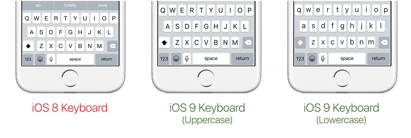
iOS 9 could have - and to some, should have - been merely a maintenance release. Tim Cook could have stood on stage, put up a “0 new features” slide, and I would have applauded right at my computer screen. But surprisingly, iOS 9 has enough new to warrant the bump in major version number. Having updated to the latest beta build, my iPhone does not feel substantially different, but subtly improved. There’s a new system font - San Francisco - which debuted on the Apple Watch last year and can also now be found on OS X 10.11 El Capitan; there’s the new keyboard, which now displays capital or lowercase letters depending on what you’re about to type. The new Music app is there following its debut on iOS 8.4 earlier this week. The Notes app has been updated with some new functionality, if you care about that sort of thing.
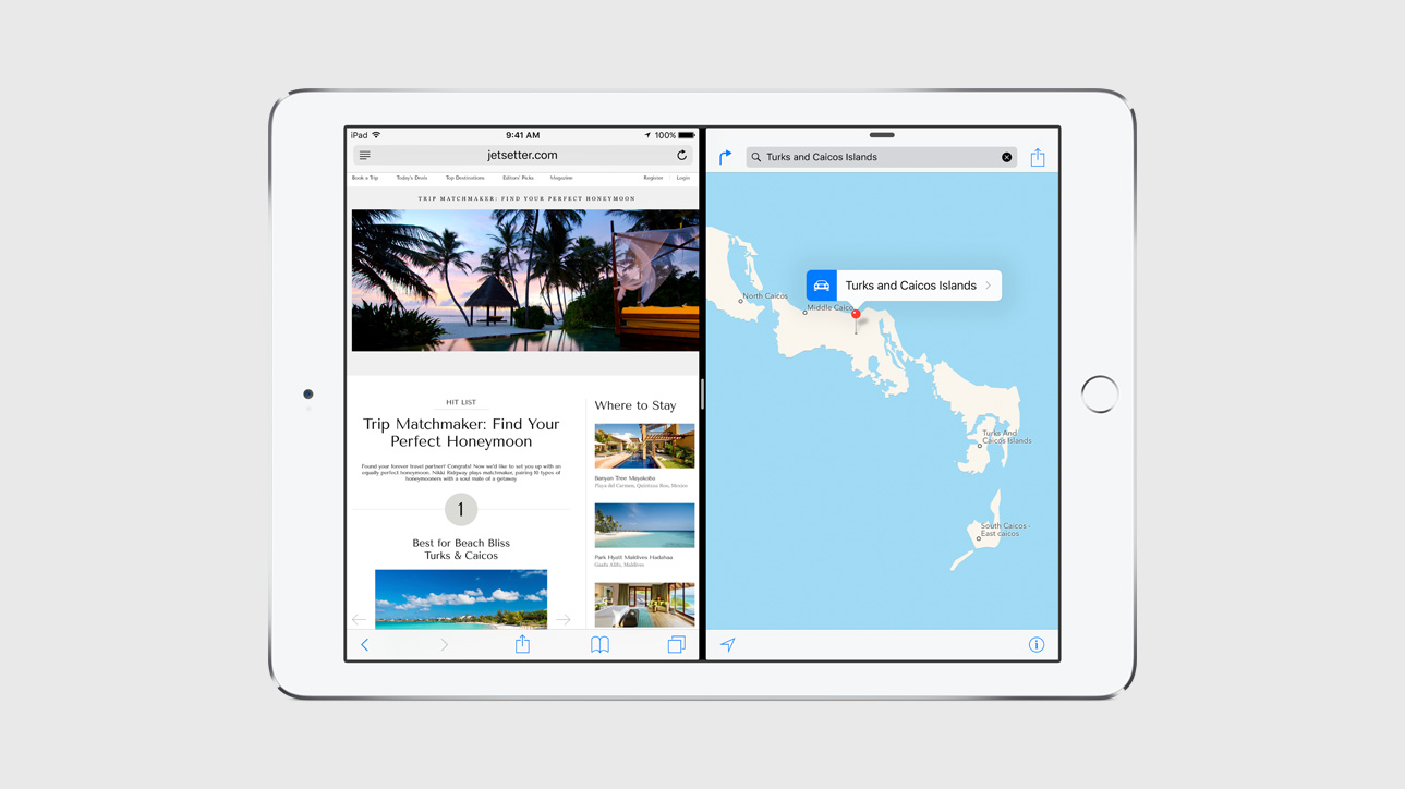
But on the iPad? Well, iOS 9 makes the iPad feel like a whole new device. Split View - currently available only on the iPad Air 2, likely due to RAM and CPU constraints on other models - is very arguably iOS 9’s killer feature. Split View allows you to run two iPad applications side by side, a concept made first mainstream by Windows 8 back in 2012.
This has the potential to improve the iPad user experience in extraordinarily substantial ways. Say you’re playing Hearthstone (my personal new addiction), but your significant other sends you an iMessage wanting to make plans for dinner. With iOS 8, you have two choices - text on your iPhone and continue playing on your iPad, or constantly switching back and forth between Hearthstone and the Messages application. And, of course, if you’ve got a lot going on and your iPad is memory constrained, Hearthstone will inevitably exit costing you a nice big red “loss” on the record books. But now with Split View on an iPad Air 2, you can keep Hearthstone open and dock Messages on the side of the screen, with both working as they should simultaneously.
But because the iPad in my possession is a day one iPad mini 2 (then called the iPad mini with Retina Display - goodness, I don’t miss that ridiculous naming scheme), I have been unable to test Split View. What I can test is its lesser cousin, Slide Over. Slide Over works similarly to Split View in the sense that you can theoretically use a second app without closing your primary application, but the catch here is that second application doesn’t stay “stuck” to the side of the screen, and that process is constantly started and stopped as you open and close the slider over.
Going back to our previous example with Hearthstone and Messages, Hearthstone will take up the entirety of your screen until you need to jump to your conversation. To do that, you swipe left from the right side of the device, which will allow you to select and temporarily open the Messages application. Once open, you can use the Messages app like normal - scroll through the conversation, tap out a reply - all with Hearthstone still open in the background. Once you tap back on Hearthstone, Messages will undock and the process will be terminated. It’s a general usability improvement, sure, but it’s frankly a little confusing for many to understand and has caused issues on my RAM constrained iPad mini 2 where both applications lock up and crash. I fully expect stability to improve in future builds.
The last major new feature, available both to iPhone and iPad (and the iPod touch) is called Proactive, available on iOS’s newly redesigned Spotlight page. Apple’s much anticipated answer to Google Now. Unfortunately, at this point in development, there’s not too much to write about.
It’s not that Proactive is bad, it just doesn’t really do much. Whilst Google Now is full of useful information at a glance, Proactive is limited to displaying shortcuts ot contacts you might want to talk to, apps you might want to open, places you might want to go to, and news you probably don’t want to read. The issue is that there doesn’t seem to be much underlying context to these suggestions based on location, time of day, or anything of that sort. Suggestions never seem to change for me, suggesting “Fun” locations in the middle of the work day or contacts I feel as though I rarely talk to. The real issue is that Proactive is one of those features that might occasionally come in handy, whilst Google Now is a feature that is consistently excellent.
There is a reason for Proactive’s mediocrity, and it may be the representative of the single biggest difference between Apple and Google - their policies on data collection and how that information gets used. Apple was very clear in their keynote during WWDC that they have no interest in your data, whereas Google’s position is to collect as much about your usage as possible.. The positive to Apple’s position, of course, is superior privacy - Apple doesn’t know what your favorite morning coffee shop is, who you email most, or what your second cousin looks like. The negative is that knowing all of that would make Proactive’s suggestions more like Google’s now - that is to say, way, way, way more useful
iOS 9 is currently available to paying Apple Developers, and a public beta is currently scheduled for “later this Summer.” The final version of iOS 9 will hit your iPhone, iPad, and iPod touch this Autumn.
Next up, watchOS 2, coming soon.
11 Jun 2015
Given how much time I spend in front of a Mac for both work and play, it’s nice to see the Mac getting sort of attention it deserves with OS X 10.11 El Capitan (which I will forever henceforth lovingly abbreviate to “El Cap”).
After the radical change that came alongside OS X 10.10 Yosemite, things were certainly feeling like time for another refinement release, and that’s exactly what Apple is promising. Light on the new features, El Cap sits somewhere in between the mostly maintenance centric OS X 10.6 Snow Leopard and a more substantial one.
Sure, there are a few new goodies - Mission Control was given a few tweaks (one MacRumors member likened it to OS X 10.6’s Expose), and you can dock two full screen applications next to each other in two configurations - a 70/30 split, or a 50/50 split. There’s also a radically redesigned Disk Utility (I already pang for the old one), a new security feature called Rootless Security that secures the “integrity” of important system files and operations (no more mucking about with hacks for you, sorry), a new system font (a slightly modified version of the Apple Watch’s typeface, San Francisco). There are even some minor improvements to OS X Yosemite’s new user interface, including a new iTunes icon, some minor updates to window chrome, and - get this - a new beachball spinner cursor.
Nothing here is groundbreaking, and some of the changes might be, at first glance, strange. Much virtual ink has been spilt about the merits of Apple’s decision to switch out Helvetica Neue as the system font after just a single year at the helm, but to me the decision seems right in Apple’s wheelhouse. Helvetica - and, by extension, Helvetica Neue - is a fantastic font, but there’s a reason most software developers don’t base their entire user interface around it. Something about Helvetica Neue always seemed just a bit off in Yosemite, especially on my 2011 MacBook Pro’s sadly non-Retina display. When Apple released the original San Francisco font alongside WatchKit late last year, some enterprising hackers figured out a way to utilize it as the system font on Yosemite. I rushed to make the change at the time, and I never regretted the change - El Cap’s updated San Francisco makes it even more palpable. Plus, San Francisco has always been a friendly enough san-serif font close enough to the likes of Helvetica Neue, so I doubt most users will notice or care about the change one way or the other.
There is one very interesting addition to El Cap, and that’s the improvements to Spotlight. For years now I’ve kept the dream of Siri on the Mac alive, and for years now I’ve been disappointed. El Cap continues to not have Siri (for some reason I’ll continue to not comprehend), however Apple has gone a long, long way towards infusing OS X with some smart assistant functionality through Spotlight. Just like you can ask Siri what the weather is like outside on iOS, you can now type “weather Boston” into Spotlight and get the same result.
Don’t get me wrong - this is not Siri, and this is not a Siri replacement. Not even close. Spotlight just isn’t smart enough, unable to replicate even some of the most basic Siri functionality just yet. For example, I frequently ask Siri, “Where can I get some dinner around here?” and get a valuable list of options. I’m typing that same query into Spotlight on El Cap, and I’m coming up blank. Likewise, I can’t use Spotlight to create reminders, set alarms, or anything of the sort just yet.
But this is a start, a glimpse at a new, exciting, smarter OS X. One that works for me in a way that iOS has for some time. For the first time, a desktop operating system is starting to adapt to the way I work rather than the other way around. And at this point, I’m more than happy to take what little table scraps I can collect.
Since I’m a mad man with no care in the world, I’ve been running the first Developer Preview of OS X 10.11 El Cap since Monday night, and this is one of the best experiences I’ve had with a beta operating system in some time. It’s totally unfair to say much of anything about a beta release, so I’ll leave further real world impressions for another time. That said, this first release is fast, stable, and drama free, even at this early stage. Oh, Windows 10, how I wish I could say the same.
Next up, iOS 9 Notes & Impressions. Coming later this week.
23 May 2015
I’m almost exactly a month into my time with the Apple Watch, and overwhelmingly my feelings towards the device haven’t changed. At the time of my writing my previous Apple Watch piece, 47 Hours with the Watch, I figured I would around now follow up with a second, comprehensive piece outlining how my feelings towards the Watch had changed. Interestingly, nearly everything I wrote back then still stands – I haven’t had some sort of revolution that completely changed the way I look at the device, so if you’re interested in knowing my feelings towards the Watch as a whole, just go back and read that piece.
Overall, I find the Watch a comprehensive, worthwhile device that pushes back and acts on you as much as you act on it. If I were to single out a singular point that most desperately needs some t.l.c., I would be compelled to say that has to be the Apple Watch’s watch face options.
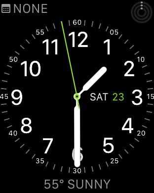
The Watch supports nine different watch faces – Chronograph, Color, Modular, Utility, Mickey, Simple, Motion, Solar, and Astronomy. After using the Watch for as long as I have, I can comfortably say that only four of these are worth using on a regular basis.
One of the most compelling aspects of the Watch comes in the form of complications, tiny widgets that sit on your watch face and provide quick insights of important information. By using a watch face that supports a good variety of complications, you’re able to quickly learn the time, current weather conditions, your next meeting, your fitness progress, and more – all from an extraordinary brief glance at your watch. More than anything, I have come to use my Watch as the place where all my important data come together and live. Complications are the backbone of that experience.
Given how important complications are to my overall Apple Watch experience, it’s fascinating – and maddening – that three of the watch faces (Astronomy, Solar, and Motion) simply don’t support complications at all, while a fourth (Mickey) is far too specific to certain Disney mouse to really make much sense as a daily driver. I did have some fun using Mickey at a gathering with some friends, though.
I just spent a couple of days with what I find to be the most beautiful of the Apple Watch faces, Solar, and found myself just constantly frustrated with its lack of basic functionality. Solar gives you glancable access to the time and the sun’s location relative to the Earth – that’s it. During my time with Solar, I consistently out of habit tried to glance at my Watch for the current temperature or my fitness progress only to be frustrated when none of that was there.
Sure, I could have spent an additional three seconds swiping up to my Glances and got the same information with Solar, but in that same amount of time I could have easily gotten as much or more of the same information from my phone. When talking the utility of the Watch, every second counts. That’s kind of my problem with Glances on the whole; they’re too far away from the home screen to warrant the relatively small amount of information they provide the user. More times than not, if I’m trying to get at something more than a complication, I’ll just click the Digital Crown and launch the full blown app.
 Over the last couple of weeks I’ve spent most of my time looking at just two watch faces – first Modular, a digital display with lots of complication support, and Utility, an analogue display with decent complication support. As far as I’m concerned, you can’t go wrong with either of
these faces – Utility’s digital time display is perfect when I don’t feel like thinking, while Utility gives a sense of tradition while still giving me easy access to all the complications I’ve grown accustomed to.
If you’re just picking up your Apple Watch or will be soon I suggest taking a couple of days to really put every watch face through their paces and see which one suites you best. But I also highly recommend you really try to make as much use of complications as you can. You never know when you might need to know where your next meeting is, as fast as possible.