24 hours with the iPhone X and its notch
04 Nov 2017
Like most people who received an iPhone X this week, it’s too early to really give a proper iPhone X review, and it’s certainly next to impossible to really determine how this year’s new flagship phone will impact the way the world interacts with smartphones. Instead, I can offer up a few preliminary thoughts - just some quick impressions after using the iPhone X for a hair over 24 hours, from the perspective of somebody who has owned the “Plus” size iPhone since the release of the iPhone 6 a few years back.
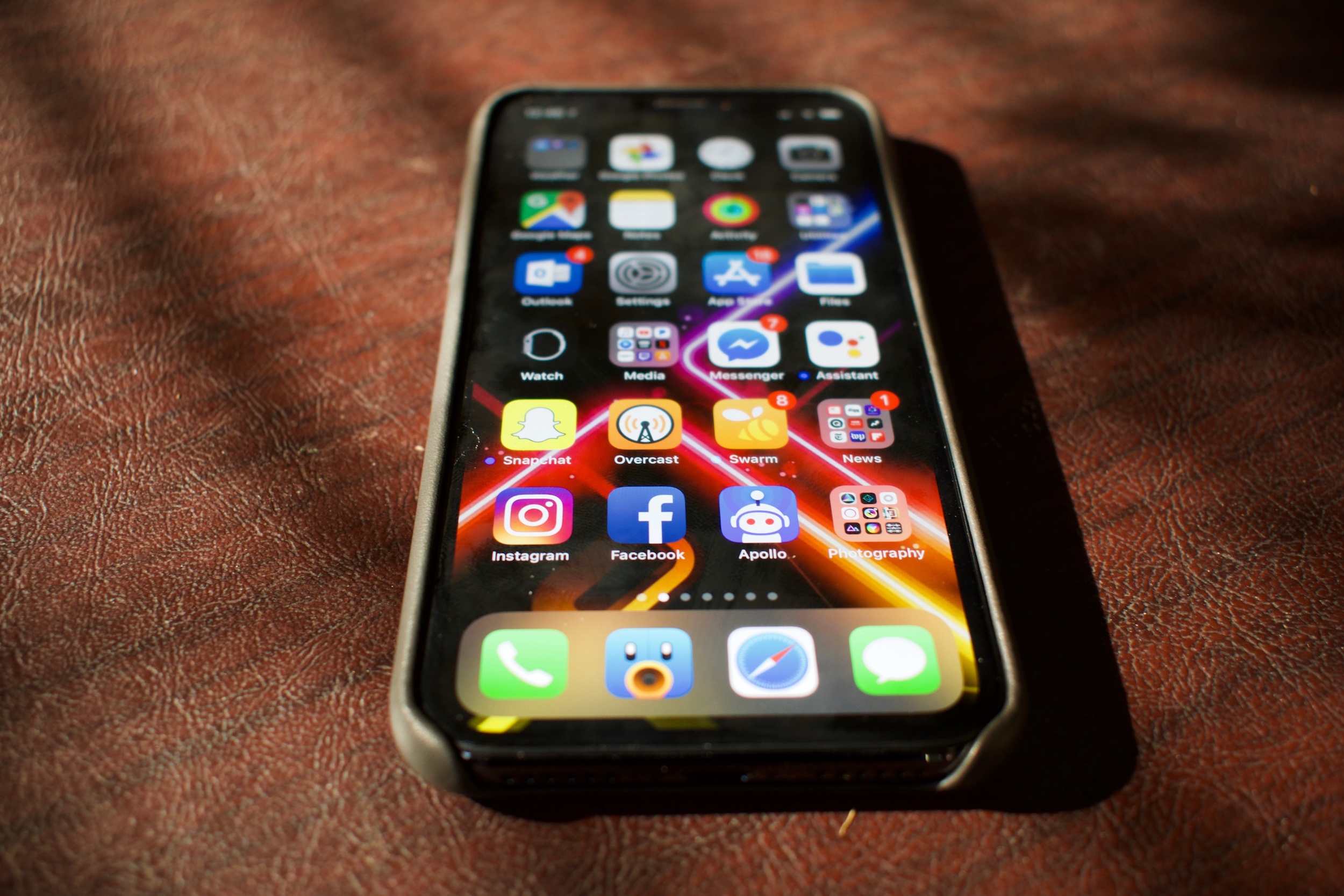
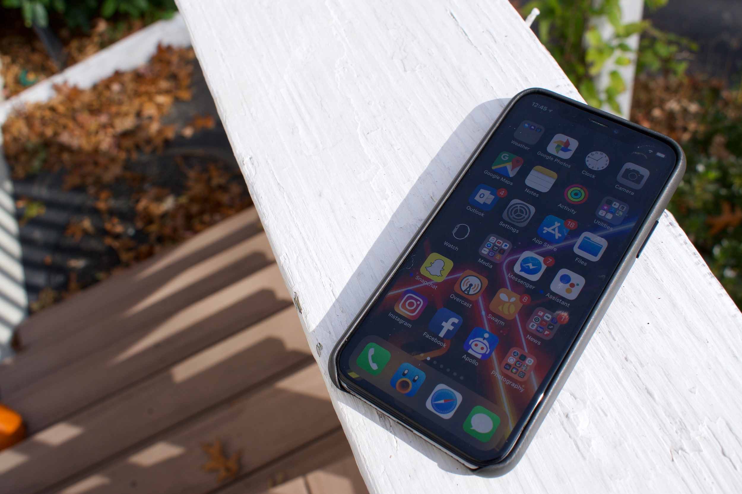
There are a lot - and I mean, a lot - of things to like here. The iPhone X feels like its specifically engineered to be as tight a package of the most impressive smartphone technology you can possibly purchase in 2017. The real star of the show is, of course, that all-new edge-to-edge industrial design. The entire frame of the device, barring the infamous “notch” area that houses the new front facing camera system that powers the phone’s facial recognition functionality, is flanked right up against the edges by what has to me the single most beautiful display I’ve ever seen in my entire life.
That’s not an exaggeration. The iPhone X’s 5.8-inch display, reportedly manufactured by Samsung and engineered by Apple’s display team, is exceptional. It’s bright, but not eye-burning bright. It’s as vivid as you can get before colors begin to look overblown and oversaturated. It’s contrasty - oh, goodness, is it contrasty. Like the best of previous OLEDs, blacks are absolutely black. When up against a black wallpaper or titlebar, the notch becomes perfectly invisible. This is the best display Apple has ever released, and I can’t wait to see a larger version hit the iPad Pro line in the future.

Because the front of the phone is taken up completely by the OLED display, Apple has forsaken the home button - and, in turn, its Touch ID fingerprint reader technology - with what it calls Face ID, facial recognition powered by a radically enhanced front facing camera system. Next to the display, Face ID is clearly the real focus of Apple’s marketing this year, and understandably so: when it works, Face ID feels like complete magic. Some early reviews have noted that using Face ID feels like having no biometric protection at all; pick up your phone, swipe up from the bottom, and you’re in.
Unfortunately, my experience with Face ID hasn’t been perfect. Under the somewhat dim indoor lighting I’ve spent the most time using iPhone X in so far, I’ve experienced a failure rate slightly higher than that of Touch ID - and it can occasionally, and randomly, get pretty slow, too. There have been more than a couple of instances where the iPhone will seemingly randomly decide it doesn’t recognize my face and won’t authenticate me, no matter how I adjust my phone or my head, until I relock the phone and unlock it.
Worse, I have yet to be able to determine why Face ID is failing in these instances - there doesn’t seem to be any rhyme or reason for its failures. There has been no consistency in lighting, my position relative to the phone, or where I’m looking while unlocking. It’s the sort of issue that can make using the iPhone X an occasionally worse experience than using my iPhone 7 Plus, though I may re-set up Face ID to see if that improves my experience.
Once you’re authenticated, the experience of actually using the iPhone X is another huge change, but one that I’m significantly more positive about. In all previous iPhones, the home button was a safe haven; wanted to go home? Press the home button. Want to ask Siri a question? Home button. Multitask? Home button. Reachability, to reach to the top row of icons that can’t easily be reached? Home button. Given the iPhone X has no home button, Apple has implemented an entire new system of gestures to replace most of these interactions (and moved Siri to the side button), and the vast majority of these feel instantly natural. Swipe up from the bottom to go home, swipe up and hold to multitask; swipe down from the top right to access Control Center, swipe down from the top middle or top left to enter Notification Center.

While these gestures truly began to feel great after just a few short minutes of using the phone, there is one big miss for me. Reachability - which is, tellingly, now disabled by default - has been relegated to a quite tricky to pull of “swipe down from below where the dock is on the home screen, to the very bottom of the screen” gesture. Because there’s a tiny few rows of pixels to manipulate below the dock, actually using Reachability is now difficult whereas it used to be easy. It’s a shame, too, given how tall the iPhone X’s display is, in my eyes Reachability is actually more important than it ever was in the iPhone 6, 7, or 8 Plus models. I’m not entirely sure what a better solution than this would look like, but it does make reaching the top row of icons on the home screen much, much more difficult.
It’s ironic then that my singular biggest issue adjusting to the iPhone X is that, coming off of years of the Plus sized iPhone, the iPhone X just feels incredibly small. It’s true that the iPhone X technically has a larger, 5.8 inch display than the iPhone Plus’s 5.5 inch one, but it’s much, much more narrow than the Plus creating a display that’s significantly smaller when it comes to usable space. This has caused significant issues for me in day to day, average use. Typing on the iPhone X feels… well, honestly, bad. I’m making all sorts of typos and I can feel my fingers gripping the phone in strange ways. I’m absolutely positive that this is something I can force myself to get used to in time, but the adjustment period here has been pretty significant for me, and I haven’t quite gotten over that hump yet.
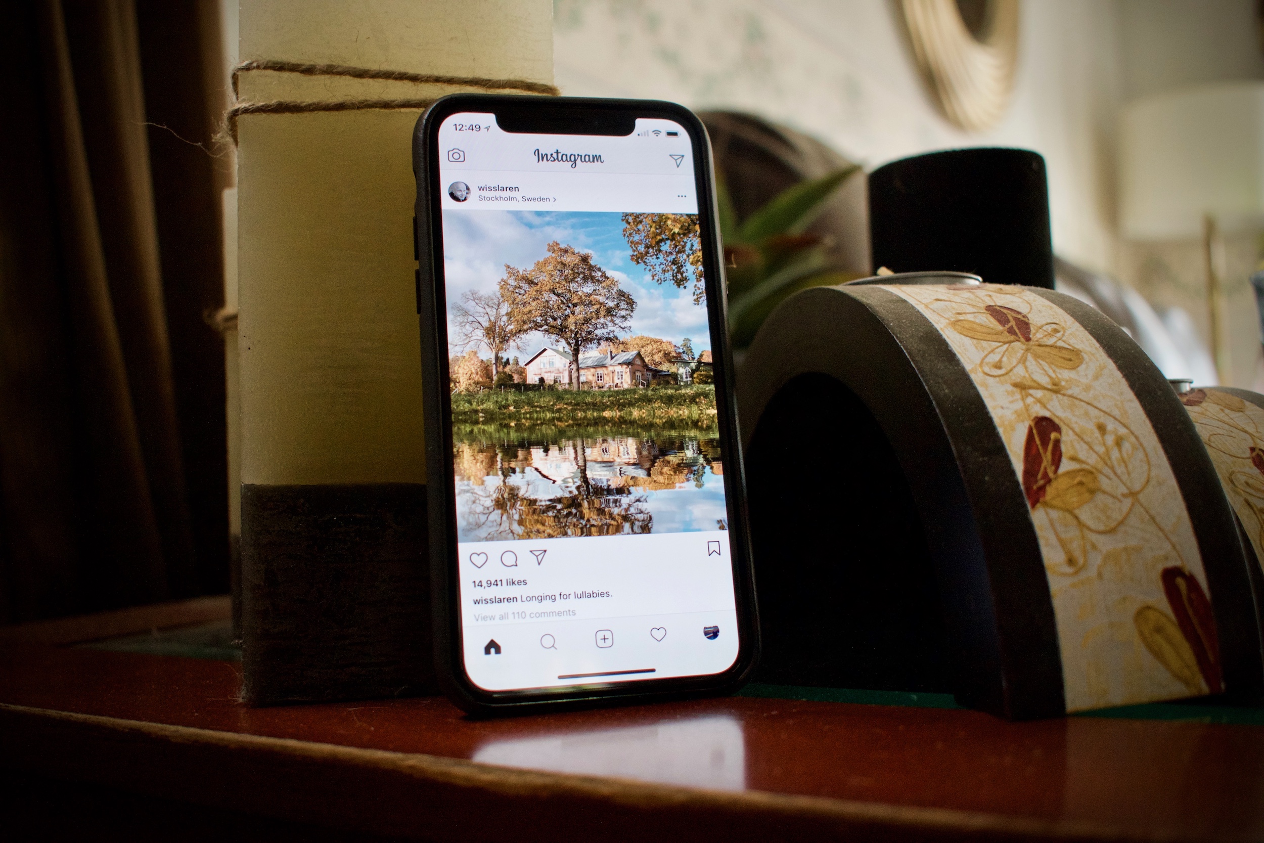
What I’m less sure I’ll get over, however, is just how small media is on this display. I’m what you could call an Instagram completist - scrolling through my Instagram feed and appreciating over processed, filtered photos is one of my favorite things to do on an iPhone. Unfortunately, Instagram photos look like stamps on this narrow screen. Watching videos seems not insignificantly downgraded, too, partly because the only non-insane way to watch videos is to scale it down out of the way of the notch, which makes the already smaller display significantly smaller, creating unsightly software bezels.
Using the iPhone X in landscape mode in any way, shape, or form is significantly worse than using any previous iPhone. I know, I know, I can hear you from here - but Brian, no one uses landscape mode! Well, to be honest, I do, and the iPhone X’s narrow display is wrecking havoc on my usage. Before, landscape mode was the way I used Safari, Twitter, Outlook, and (I know, I’m a monster) occasionally, even the home screen. Landscape mode home screen curiously isn’t even an option on the iPhone X, and the others feel far too tight to make them really usable. It’s a bit of a bummer.

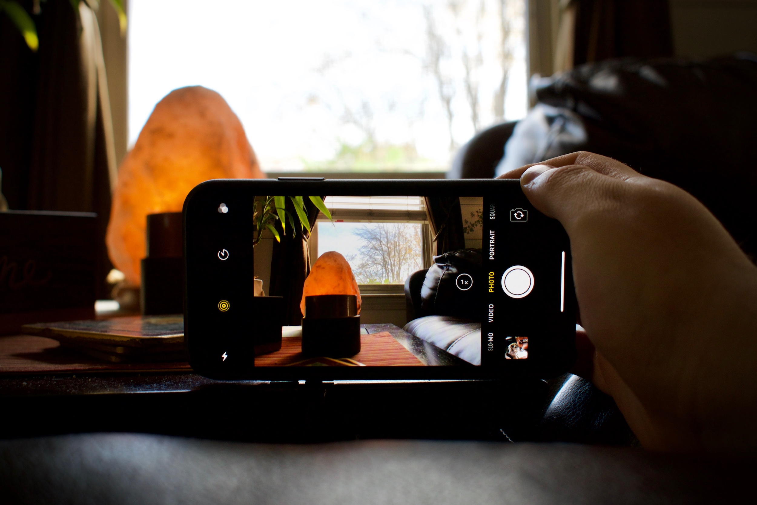
There’s still plenty I have yet to do on my iPhone X, and I’m planning on making use of every single day of its 14-day return policy before I decide whether or not I’m keeping it, or waiting another year. I have yet to put its vastly upgraded cameras through their paces, and I have yet to really push the best-in-class A11 Bionic SoC - though, if benchmarks are any indication, it’ll blow everything in the smartphone space away.
The iPhone X is quintessential 2017 Apple. It’s fresh, interesting, and occasionally infuriating. It feels like magic, until it doesn’t, and then it feels a little bit like too far of a step backwards then I’m totally comfortable with.
But oh my goodness, guys. That screen. Holy shnickies, a screen this beautiful might make it all worth it.