10 Sep 2019

The iPhone 11’s camera bump is ugly. The iPhone 11 Pro Max name is bad. And what is going on with iOS 13?
There, we got all of the obvious jabs out of the way early. Frankly, I don’t want to harp on them too much, because I think by this point we’ve all spilt a little too much e-ink talking about them already.
Today, Apple held its annual September 2019 Special Media Event, a time honored tradition for over a decade now. In the 2000s, Apple used this prime spot on the calendar to unveil upgrades to its once killer (and now, sadly, largely killed) iPod line-up. These days, we get the modern equivalents: the year’s new iPhone and Apple Watch. And services. And the iPad I guess? Why not.
The Services
Apple Arcade
Apple announced that Apple Arcade, its Xbox Game Pass-style subscription service for games on iOS, tvOS, and macOS, will officially launch on September 19 for just $4.99 a month, with a one month free trial. Apple spent a decent chunk of time showing us game demo after game demo, but here’s the nitty gritty: folks love playing games on their iPhone, and this looks like a great opportunity to pay about $5 a month for a bunch of great looking games.
It’s not that Apple Arcade is boring, persé; I actually find the very concept of Apple of all companies spearheading a game subscription service fascinating, given Apple’s struggles in this market. But frankly, I think I’m just not Apple’s target market here. I much prefer playing portable games on my Nintendo Switch, with its tactile controls and superior third party software support. I’ve been playing Threes for something like six years now. I already bought Threes, so I think I’m ok for now.
Still, I’ll be curious to hear feedback from the general public and more hardcore iOS gamers on Apple Arcade. It seems like a great deal.
Apple TV+
I watch a lot of TV. No, really, I watch way too much TV. The problem is that there’s far too much great television out there these days, between a seemingly fantastic new Netflix series launching practically every time I finish the last one, to Amazon Prime’s great selection, Hulu, and so much more - we are truly living in a golden age of television.
How can Apple TV+, with no known back catalog and only a handful of shows, possibly compete?
Well, as it turns out, the Apple TV+ can compete on price. Apple announced that the Apple TV+ will officially launch on November 1 for just $4.99 a month - or, crazy enough, completely free for a year if you purchase a new Mac, iPhone, iPad, or Apple TV. And to sweeten the deal, they’re not just giving you Apple TV+ - they’re giving it to your whole family, up to five people with one subscription. Apple is under no pretenses of how viewers utilize their subscriptions.
Even so, where Apple TV+ really has to compete is on the quality of their programming. The excellent price gets them halfway there, but who wants to pay $4.99 a month for a bunch of stinkers? Without any advance reviews to refer to quite yet, it’ll be a little while before we can learn the true value of Apple’s vision for the future of premium television content. All we know so far is that it will be very un-sexy. Taste is completely subjective, but I think See looks great, though.
Apple News+
Apple News+ remains a product in Apple’s lineup.
The Hardware
iPad
Here we have something of a surprise - or at least it would have been, if you don’t follow the ever presaging Mark Gurman. Although there had been virtually no rumors suggesting we’d see any new iPad hardware at this event - Apple typically saves those for its October Special Events, a frequent occurrence - Apple announced the new seventh generation iPad. That’s iPad, without a qualifier.
Although the internals of the iPad remain largely unchanged, sporting a surprisingly low end and, well, frankly disappointing A10 Fusion SoC, the iPad now sports a new, larger 10.2 inch display, Smart Keyboard support by means of its Smart Connector, a first for base model iPads, and shipping with iPadOS, today’s new iPad is the definition of iterative. It even keeps the sixth generation iPad’s disappointing screen to body ratio despite the new larger display, firmly planting the iPad as a device that screams “last gen.””
My problem with this device is that, now that it features a 10.2 inch display and smart connector, doesn’t the iPad invalidate the existence of the iPad Air? In my view there’s simply not enough to differentiate the two anymore, besides 0.3 inches of screen size and an A12 Bionic SoC.
If I were the fruit company, I would have taken the iPad Air, dropped the modifier, and called that product the seventh generation iPad, replacing last year’s model. I suppose they can’t yet hit the iPad’s ultra low price point with the A12 Bionic, but the current lineup no longer makes sense to me.
Apple Watch Series 5
The typically reliable rumor mill really let the Apple Watch down this year. Despite numerous reports indicating that the Apple Watch would be skipping a year for the first time since 2015, Apple did indeed announce the Apple Watch Series 5, a fairly significant update to the Apple Watch lineup, at least as substantial as the Series 2 and the Series 3 before it.
The tentpole feature this year is the Apple Watch’s all new Always-On Retina display, made possible by a new LTPO OLED display. From what I understand, this new display is capable of limiting its power draw during “down time” to the point where including an always-on display has a negligible hit on battery life.
The new Apple S5 SoC, which Apple declined to discuss in any great detail, is likely a slightly optimized version of the S4 SoC found on last year’s Series 4 for the sole purpose of enabling the always-on capability. Apple makes no performance claims this year other than stating that its 2x faster than the now two year old S3 SoC. It’s worth pointing out that this is the exact same claim Apple made of the S4 last year.
Beyond the Always-On OLED display and the new SoC, the new Apple Watch also comes in two new finishes - Titanium and Ceramic. Ceramic was actually sold previously in the Series 3, though this marks the first time the Apple Watch comes in a Titanium finish. I don’t think Apple did as great a job explaining the benefits of the new materials as they have in the past. As someone who is far from a watch person, I know little beyond what this new material would offer me over the less expensive Stainless Steel models.
It also includes a built in compass, which would make Dustin Henderson quite happy.
iPhone 11
The iPhone XR was the default iPhone.
That might seem strange, considering the iPhone XR was originally pitched as a low end alternative to the more expensive iPhone XS, but it was a consumer hit and has seemingly outsold its more expensive sister in arms.
Now Apple has readjusted, and the XR’s successor is not the iPhone 11R, but the iPhone 11. Featuring the same aluminum and glass industrial design of the iPhone XR, the iPhone 11 comes in a bunch of fun new colors, including a Mint Green I’m particularly fond of, the new A13 Bionic SoC, and a redesigned camera system featuring the brand new ultrawide angle lens.
You’ve probably seen this in this year’s Samsung Galaxy devices, and people seem to really enjoy these. They’re great when you have a large subject you’re trying to get entirely in the frame, or when photographing vast scenic landscapes, although they all tend to exhibit some pretty heavy barrel distortion.
The iPhone 11 is largely iterative, and that’s okay. We’ve firmly entered an era where Apple delivers major design upgrades on a three year cycle, rather than the old two year one. My only wish is that Apple would re-evaluate their naming strategy in light of this. The iPhone 11 is clearly a third-generation iPhone X, not the first in a next-generation lineup as the name would imply.
iPhone 11 Pro & iPhone 11 Pro Max
I know I said at the outset that I wouldn’t harp on this, but c’mon, Apple, really? iPhone 11 Pro Max? What, did “iPhone 11 Pro Max Xtreme Deluxe” not fit on the box?
If the iPhone 11 is a follow up to the iPhone XR, the iPhone 11 Pro phones are the follow up to the iPhone XS lineup. And like the iPhone 11, it is hugely iterative; in truth, beyond the new camera system, a slightly improved OLED display Apple is calling “Super Retina XDR” (because branding), the new SoC, and two new finishes (a “new” Gold and a beautiful Dark Green), the iPhone 11 Pro is a pretty minor upgrade.
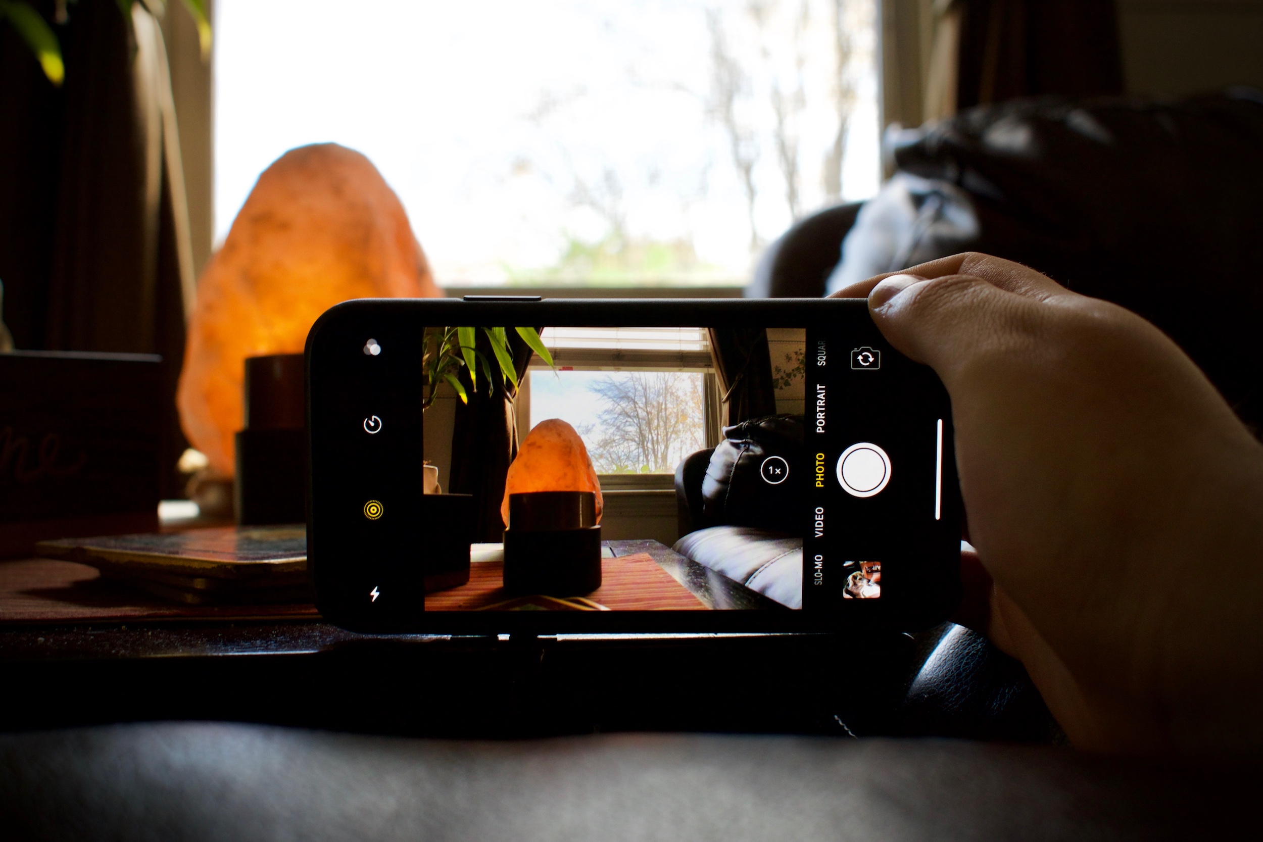
Getting back to cameras, both the iPhone 11 and iPhone 11 Pro do come with a brand new Night Mode, made to compete with the truly excellent Night Sight functionality of Google’s Pixel lineup of phones. Night Mode, like Night Sight, uses machine learning to drastically improve photographs taken in low light situations, removing noise, upping the exposure, and creating more usable photographs. I’m a huge fan of this and wish that this was something that would come to my iPhone XS Max; it might be the single biggest “killer” feature of these new models.
The iPhone 11 lineup will launch alongside the Apple Watch Series 5 next Friday, September 20, 2019. My fellow early adopters take note - Apple has ended the midnight preorder party we’ve all become so accustomed to, opting instead to launch Apple Watch Series 5 preorders immediately, and iPhone 11 and iPhone 11 Pro preorders Friday at 5 AM PST.
Goodbye, midnight iPhone pre-order Twitter. Oh how I’ll miss you.
04 Nov 2017

Like most people who received an iPhone X this week, it’s too early to really give a proper iPhone X review, and it’s certainly next to impossible to really determine how this year’s new flagship phone will impact the way the world interacts with smartphones. Instead, I can offer up a few preliminary thoughts - just some quick impressions after using the iPhone X for a hair over 24 hours, from the perspective of somebody who has owned the “Plus” size iPhone since the release of the iPhone 6 a few years back.
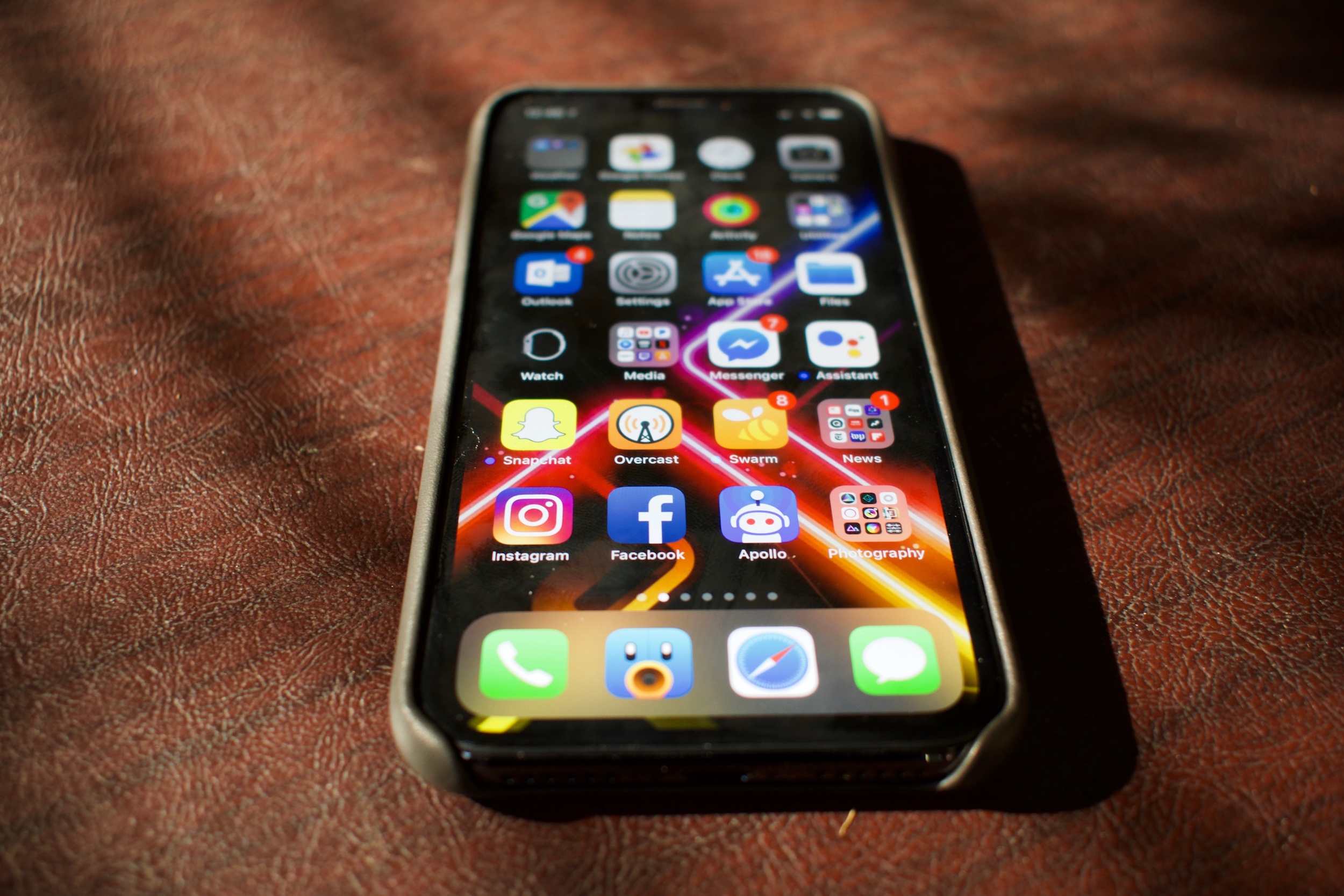
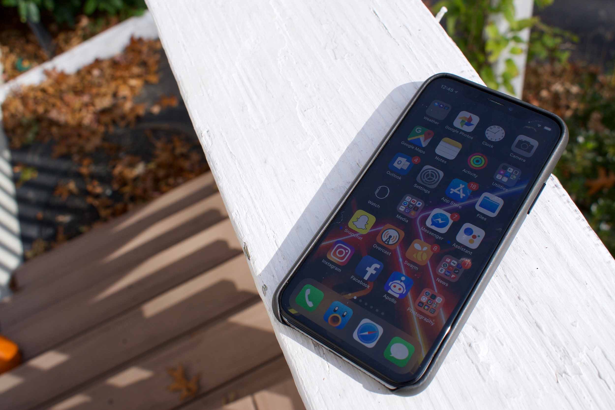
There are a lot - and I mean, a lot - of things to like here. The iPhone X feels like its specifically engineered to be as tight a package of the most impressive smartphone technology you can possibly purchase in 2017. The real star of the show is, of course, that all-new edge-to-edge industrial design. The entire frame of the device, barring the infamous “notch” area that houses the new front facing camera system that powers the phone’s facial recognition functionality, is flanked right up against the edges by what has to me the single most beautiful display I’ve ever seen in my entire life.
That’s not an exaggeration. The iPhone X’s 5.8-inch display, reportedly manufactured by Samsung and engineered by Apple’s display team, is exceptional. It’s bright, but not eye-burning bright. It’s as vivid as you can get before colors begin to look overblown and oversaturated. It’s contrasty - oh, goodness, is it contrasty. Like the best of previous OLEDs, blacks are absolutely black. When up against a black wallpaper or titlebar, the notch becomes perfectly invisible. This is the best display Apple has ever released, and I can’t wait to see a larger version hit the iPad Pro line in the future.

Because the front of the phone is taken up completely by the OLED display, Apple has forsaken the home button - and, in turn, its Touch ID fingerprint reader technology - with what it calls Face ID, facial recognition powered by a radically enhanced front facing camera system. Next to the display, Face ID is clearly the real focus of Apple’s marketing this year, and understandably so: when it works, Face ID feels like complete magic. Some early reviews have noted that using Face ID feels like having no biometric protection at all; pick up your phone, swipe up from the bottom, and you’re in.
Unfortunately, my experience with Face ID hasn’t been perfect. Under the somewhat dim indoor lighting I’ve spent the most time using iPhone X in so far, I’ve experienced a failure rate slightly higher than that of Touch ID - and it can occasionally, and randomly, get pretty slow, too. There have been more than a couple of instances where the iPhone will seemingly randomly decide it doesn’t recognize my face and won’t authenticate me, no matter how I adjust my phone or my head, until I relock the phone and unlock it.
Worse, I have yet to be able to determine why Face ID is failing in these instances - there doesn’t seem to be any rhyme or reason for its failures. There has been no consistency in lighting, my position relative to the phone, or where I’m looking while unlocking. It’s the sort of issue that can make using the iPhone X an occasionally worse experience than using my iPhone 7 Plus, though I may re-set up Face ID to see if that improves my experience.
Once you’re authenticated, the experience of actually using the iPhone X is another huge change, but one that I’m significantly more positive about. In all previous iPhones, the home button was a safe haven; wanted to go home? Press the home button. Want to ask Siri a question? Home button. Multitask? Home button. Reachability, to reach to the top row of icons that can’t easily be reached? Home button. Given the iPhone X has no home button, Apple has implemented an entire new system of gestures to replace most of these interactions (and moved Siri to the side button), and the vast majority of these feel instantly natural. Swipe up from the bottom to go home, swipe up and hold to multitask; swipe down from the top right to access Control Center, swipe down from the top middle or top left to enter Notification Center.

While these gestures truly began to feel great after just a few short minutes of using the phone, there is one big miss for me. Reachability - which is, tellingly, now disabled by default - has been relegated to a quite tricky to pull of “swipe down from below where the dock is on the home screen, to the very bottom of the screen” gesture. Because there’s a tiny few rows of pixels to manipulate below the dock, actually using Reachability is now difficult whereas it used to be easy. It’s a shame, too, given how tall the iPhone X’s display is, in my eyes Reachability is actually more important than it ever was in the iPhone 6, 7, or 8 Plus models. I’m not entirely sure what a better solution than this would look like, but it does make reaching the top row of icons on the home screen much, much more difficult.
It’s ironic then that my singular biggest issue adjusting to the iPhone X is that, coming off of years of the Plus sized iPhone, the iPhone X just feels incredibly small. It’s true that the iPhone X technically has a larger, 5.8 inch display than the iPhone Plus’s 5.5 inch one, but it’s much, much more narrow than the Plus creating a display that’s significantly smaller when it comes to usable space. This has caused significant issues for me in day to day, average use. Typing on the iPhone X feels… well, honestly, bad. I’m making all sorts of typos and I can feel my fingers gripping the phone in strange ways. I’m absolutely positive that this is something I can force myself to get used to in time, but the adjustment period here has been pretty significant for me, and I haven’t quite gotten over that hump yet.
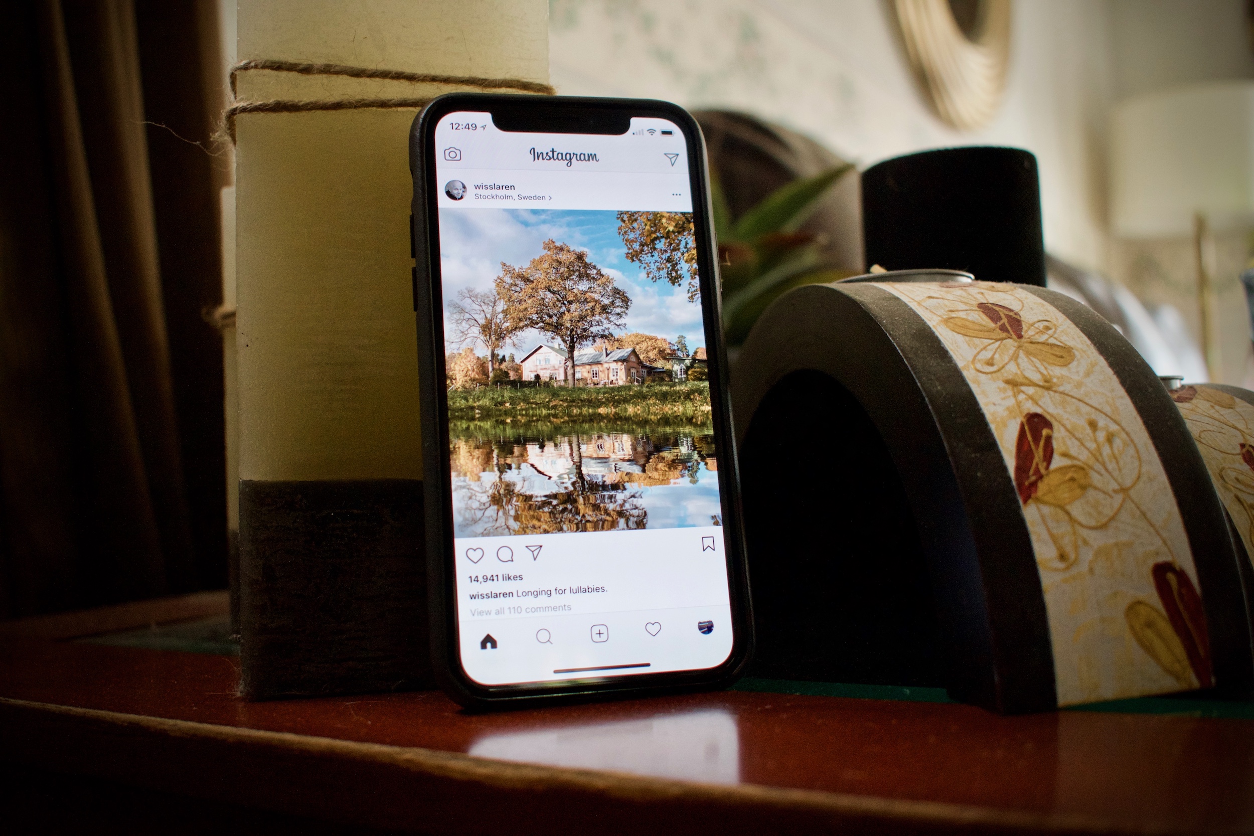
What I’m less sure I’ll get over, however, is just how small media is on this display. I’m what you could call an Instagram completist - scrolling through my Instagram feed and appreciating over processed, filtered photos is one of my favorite things to do on an iPhone. Unfortunately, Instagram photos look like stamps on this narrow screen. Watching videos seems not insignificantly downgraded, too, partly because the only non-insane way to watch videos is to scale it down out of the way of the notch, which makes the already smaller display significantly smaller, creating unsightly software bezels.
Using the iPhone X in landscape mode in any way, shape, or form is significantly worse than using any previous iPhone. I know, I know, I can hear you from here - but Brian, no one uses landscape mode! Well, to be honest, I do, and the iPhone X’s narrow display is wrecking havoc on my usage. Before, landscape mode was the way I used Safari, Twitter, Outlook, and (I know, I’m a monster) occasionally, even the home screen. Landscape mode home screen curiously isn’t even an option on the iPhone X, and the others feel far too tight to make them really usable. It’s a bit of a bummer.

There’s still plenty I have yet to do on my iPhone X, and I’m planning on making use of every single day of its 14-day return policy before I decide whether or not I’m keeping it, or waiting another year. I have yet to put its vastly upgraded cameras through their paces, and I have yet to really push the best-in-class A11 Bionic SoC - though, if benchmarks are any indication, it’ll blow everything in the smartphone space away.
The iPhone X is quintessential 2017 Apple. It’s fresh, interesting, and occasionally infuriating. It feels like magic, until it doesn’t, and then it feels a little bit like too far of a step backwards then I’m totally comfortable with.
But oh my goodness, guys. That screen. Holy shnickies, a screen this beautiful might make it all worth it.
30 Jun 2017

I’m not the first person to be writing an iPhone 10-year introspective today - a day later, and a dollar short. I absolutely won’t be the last, but I can’t stand to miss this chance to say a few words.
I wasn’t planning on buying an iPhone. Far from it - I wasn’t even sold on the benefit of smartphones yet. In January of 2007 I was dead set on getting what I viewed as the successor to my Motorola RAZR V3, the RAZR V3x. But by the time Steve Jobs ordered a thousand lattés with the prototype iPhone onstage (in what has to be my absolute favorite Stevenote moment), I was convinced.
I bought an original iPhone exactly a year from today, one day after its release. A friend of mine at the time bought it on day one, and to say I was excited to get my hands on one was an understatement of epic proportions. You have to understand, those days the simple thought of manipulating objects with multitouch on a touchscreen as gorgeous as Apple’s was unheard of. Pinch-to-zoom. Dragging your finger across the screen to scroll. Typing with your fingers. Swiping to advance to the next photo. All of these simple, natural gestures that we take for granted, these gestures that an entire generation are growing up with, seeing them as natural as the English language. These literally did not exist on June 28th, 2007, and then one day later, on June 29th, they did. Now virtually every smartphone in the world has these features.
The original iPhone was a lot of things. It was beautiful - one of the finest industrial designs to ever come out of Cupertino, period. It was comfortable in the hand, far more so than the big-screen smartphones we use today. It was also frustrating at times, with its limited feature set, and weak battery life.
I remember the day after buying mine I headed up to Maine for a family vacation, only to be gobsmacked to be nearly out of battery by 4PM or so, a far cry from my RAZR’s excellent battery. There was no video camera, there was poor lowlight performance on the camera, garbage web applications, no games, and slow 2G data. Absolutely none of that did a damn thing to hinder my excitement for the iPhone as a device, and as a platform. I was not only in love with the device I held in my hands that day, but especially with the thought of what it would be able to do a year from then, two years, three years.
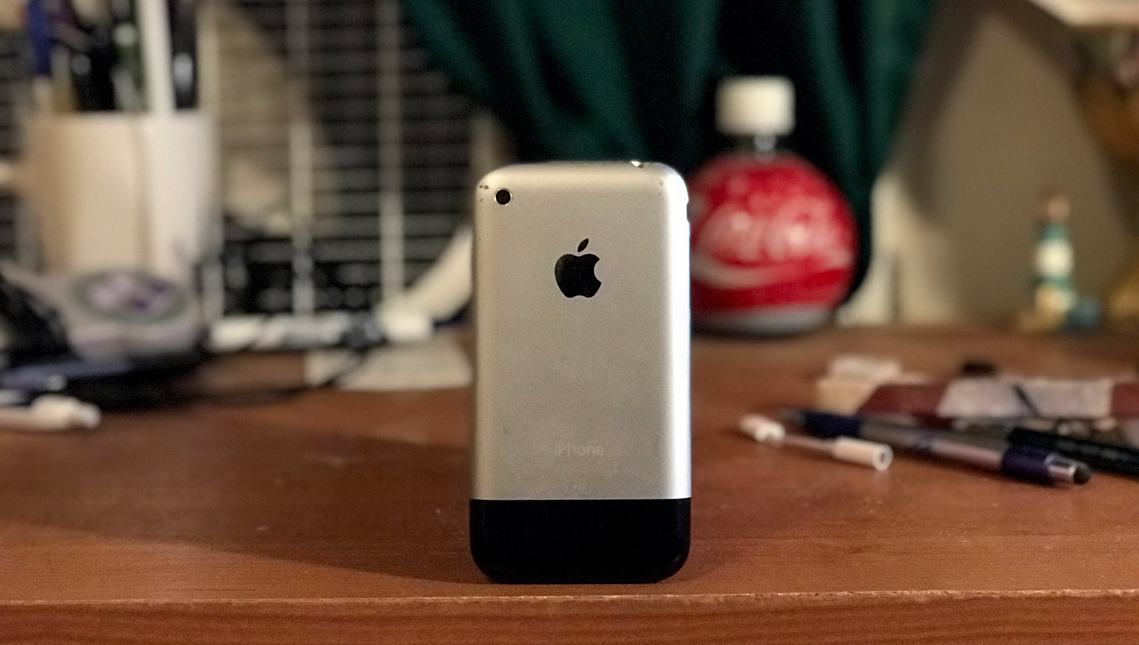
Here we are, ten years later. I’ve sold every iPhone I’ve ever owned to pay for my next upgrade, except for that original iPhone. I’m sure it’s worth a ton now, and I’m sure it’ll be worth a ton more ten years from now. It hardly matters. I’ve kept this iPhone to remember how far we’ve come, and as a testament to the revolution it ushered. The original iPhone is one of the most important pieces of technology ever built.
Happy birthday, iPhone! Here’s to the next ten years.
26 Apr 2016
Casey Liss on Liss is More, in respect to the one year anniversary of the Apple Watch:
Increasingly, I feel like I’m the only one.
I still really like my Apple Watch.
Many of my friends and peers seem to be getting rid of their Apple Watches. They’re either no longer wearing watches at all, or are switching to mechanical watches instead. I can’t help but feel like it’s trendy to be smug about the Apple Watch.
I’ve been an Apple Watch owner since day one, almost exactly one year ago. I couldn’t agree more with what Casey Liss is saying. I was going to write essentially the same on the Apple Watch, but instead I’ll advise you to read his full piece. I agree with every word of it.
The Apple Watch is not perfect. But it’s imperfect in extraordinarily similar ways that the original iPhone was imperfect. The battery life is only so and so for a device of this category, true – that will get a little better, and we will adjust the rest of the way. The app situation is not good, and apps on the original iPhone were limited to Safari pages circa 2007. Sales are not massive, with impressive Watch sales unable to compensate for the decline in many of Apple’s other product lines. It’s slow, in the same way that the original iPhone was slow. And yet, the Apple Watch has not only sold more in its first year than the original iPhone, but it’s sold more than any other smartwatch, and still more than Rolex in the last year.
I still wear my Apple Watch every single day. It’s effortless – I don’t even think about it. The way that the Watch handles notifications alone makes the device completely worth it, and the convenience of using it to quickly accomplish small tasks that I would have otherwise had to delegate to the phone buried in my pocket seals the deal. I’ve even amassed a small army of Watch bands, and changing them out depending on my mood and apparel is a blast.
The Apple Watch may not be the best product that Apple has ever made, but that was never the point. Today’s Watch is a foundation that will be built upon, improved, and tweaked over time. I can’t wait to see what watchOS 3 and the Apple Watch 2 brings to the table later this year.
18 Mar 2016
I’ve published my annual list of what to reasonably expect at this Monday’s Apple Media Event over at Haverzine.
Apple is a company of cycles. Traditionally, Apple has been bound to the calendar like Christmas to December; WWDC in June, new iPhones in September, and new iPads in October.
But Tim Cook’s Apple has been considerably more open to switching things up, forgoing expected events or making announcements at unexpected times. Today we find ourselves on the verge of one such aberrations with the announcement of Apple’s “Let Us Loop you In” Media Event scheduled for next Monday, March 21.
Apple hasn’t ever held an event quite like this, and that means no one is one-hundred percent sure of what to expect. Even so, there are a few smart bets to make. Let’s loop you in – here’s what you can realistically expect.
